

More abstract photography
Last January I did a post about one of my favorite forms of photography, abstract. I guess it struck a chord with some of you, because I received a lot of mail from that post. So I thought I’d do another one to start 2024.
The world is full of fascinating things to photograph. I’ve found that when I’m fully present and really seeing what’s around me, the first thing I tend to notice is color, and sometimes color by itself can make an intriguing composition. But more often, I move from that to looking at line, form, pattern, and texture. Finally, my photography becomes an exploration of contrast and composition, which is where the rubber meets the road, the place where the real magic happens.
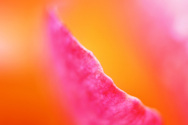
With contrast, it could be the contrast between light and dark or black and white. It could be the contrast of size: small and large. There is also the contrast of color. Take a look at the top photograph: this would be a completely different picture without the small blue and green triangle on the left, which is contrasting with the deep pink tones that surround it. That contrast creates interest.
Composition is crucial and perhaps one of the more difficult aspects of any field of art. In the top photograph, I could have centered the yellow circle—the top of the balloon—within the frame, which would create a balanced composition. I almost never do that, though, because such a composition might also be static and sometimes even a little boring. It works for some things but definitely not for everything.
Instead, I like playing with the tension of elements that are a little out of balance and off-center. That same blue and green triangle would be much less interesting if there were six of them equally spaced around the yellow center. As it is, the one blue and green triangle that we do see is pointing toward the yellow center of the balloon, directing the viewer’s eye. This element of composition creates energy and tension.
Sometimes a good photograph is made with just one of these elements, and sometimes there are multiple elements. One important point, though, is that there’s yet another element that connects all abstract photographs: the thing that has been photographed is not the subject of the photograph.
The word “abstract” doesn’t mean that the photograph lacks identifiable objects (a person, a house, the bark on a tree… ). Rather, it means that the artist found other elements to be even more compelling than the thing s/he photographed. Back to that top photograph, I could have made hundreds of photos of balloons hovering against a blue sky. We’ve all seen plenty of those, and I wanted to look for something different. For me, what was much more interesting was finding graphic patterns of eye-catching color.
With these ideas in mind, I invite you to browse through the following photographs, perhaps selecting one and identifying what some of the elements are that make it an interesting (or not) photograph. What do you see?
From my portfolio
Like last year, I’ve set up this display so that you can look at each photograph without a caption telling you what it is. It’s an invitation to take your time, to look more closely, and to write your own story about what you’re seeing. At the end of the post, there’s a full list of all the photographs, with a few words of description for each.


The photographs
I do varying amounts of post-processing of my photographs, but curiously, little or none with my abstract and macro photos. Almost everything shown in this post is how it looked when it came out of the camera; I’ll give short descriptions of any changes beyond typical spotting, dodging, and burning.
Please note that some of these photographs are listed in my Etsy shop; clicking on the photograph will take you to the listing. Some are not listed—hence no link—but drop me a line if you’d like to know more.
- Balloon in the Pink shows the canopy of a hot-air balloon; scanned from 35mm slide film, no edits.
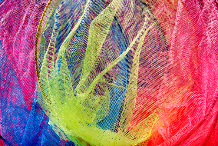
- Enmeshed is from a display of toy nets seen in a coastal village in Cornwall. My dad watched me make this photograph and then told me that I take pictures of weird things—that was when I knew I’d found my niche. Minimal editing.
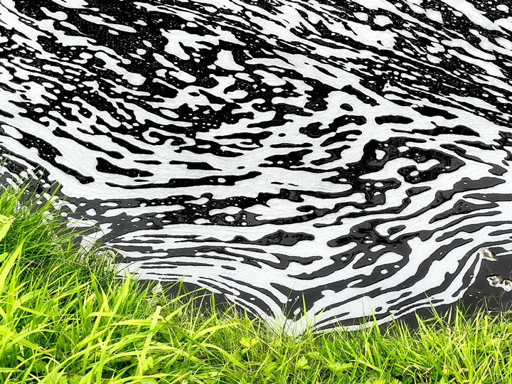
- Shifting patterns formed on a waterway at Westport House, County Mayo, Ireland. Minimal editing. Zebra in the Grass.
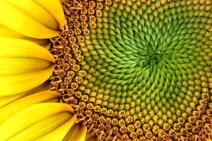
- One of the few macro photographs here that was made with my phone. Minimal editing. Green Fractals.
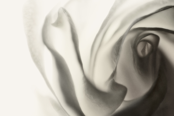
- Part of a series of back-lit white roses, exploring the flower’s intricate forms. Edited to black and white. Chiffon.
- One of my favorite roses is the Double Delight, in part because of its remarkable and ever-changing range of colors. No edits. Tropical Sunrise.
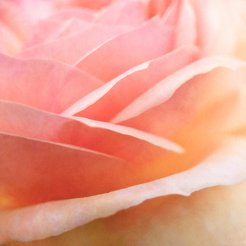
- Interpetaled (yes, I made that up) is a garden rose that gave me a splendid display of interwoven petals. Some editing for light, and to add texture.
- The trunks of aspen trees are like open books with stories to tell. This story is about triangles in a face-off. Some editing for light and to minimize color. Isosceles.
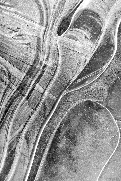
- Where there is extremely shallow water which then freezes, the result can be a rather astounding variety of pattern and shape in the ice. This looks like a macro photo, but it isn’t. Edited to black and white. On Thin Ice.
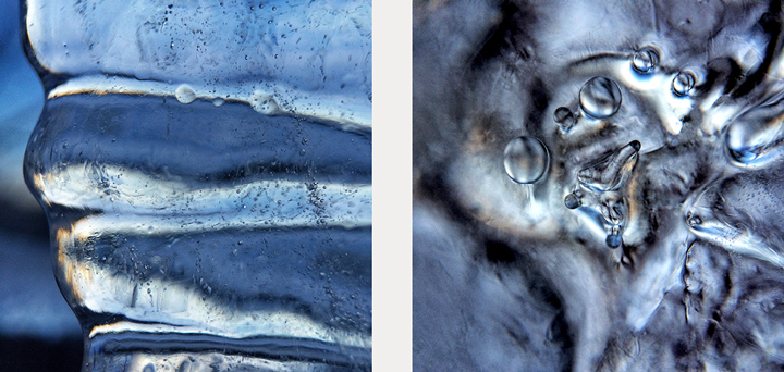
- Two macro studies of icicles on a clear, cold day. No edits. On the left is Corrugated Ice, and on the right is Where Worlds Collide.
- Sometimes I get to see the ethereal beauty that happens when sunshine pours through a stained glass window. Most often, it’s on the floor, but this is a wall next to a window in a church in Rathmullan, County Donegal, Ireland. Minimal edits. Celestial.
- In the Église Saint-Fleuret in Estaing, France, the light from stained glass windows plays intriguing games with the shadows of a row of chairs. Minimal edits, mostly for light and contrast. Estaing Light.
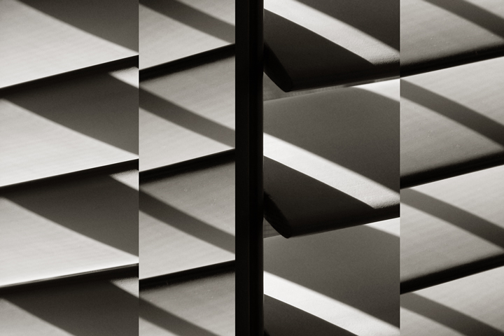
- Sunlight and shadow on plantation shutters. This is a composite of several photographs, cropped and fitted together; otherwise, no edits. Shadows, Shutters.
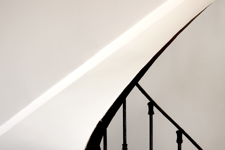
- We were staying in a two-story house in Provence, and the curve of the staircase kept catching my eye. I finally found what I was looking for with that oh-so-fine point in the upper right. Minimal editing. Sublime.
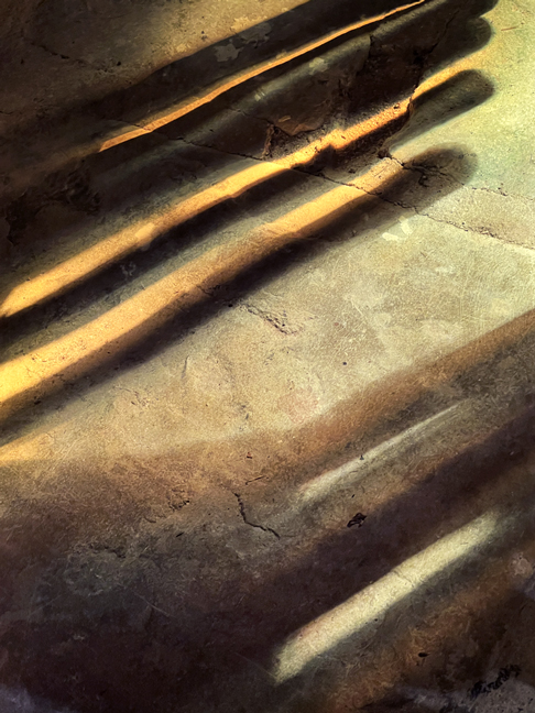
- Sometimes looking down will get me an interesting view. This is a sidewalk in Portland, Oregon, and I thought it looked like a musical staff. No edits. Black Line Black Dot.
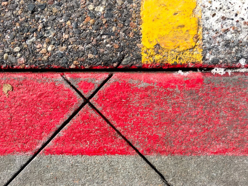
- Spotted in a parking lot in Denver, Colorado. Minimal edits. X in Red.
- It’s all about that splash of red, seen in County Mayo, Ireland. Minimal edits. Through the Windshield.
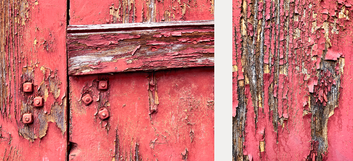
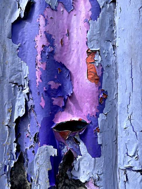
- I love the wabi sabi of the patterns and textures to be found in peeling paint. The first two are from a building in Saint-Chely, France. Chely Red 1 and Chely Red 2. Minimal editing.
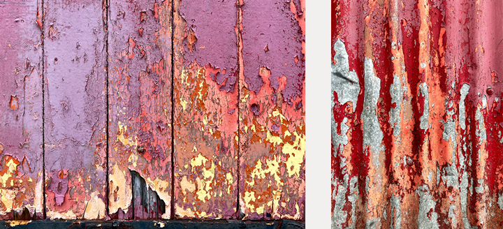
- This building in Ramelton, County Donegal, Ireland has seen uncountable layers of paint, all peeling in fascinating ways. Minimal edits. Fish Lips and the Angry Dude.
- Also found in Ramelton, also minimal edits. Left, Sailing into the Sunset, and right, Ramelton Red Ribs.
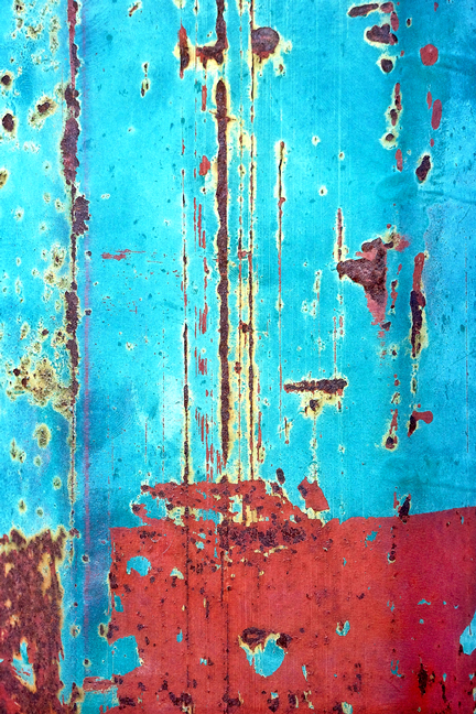
- From a colorful pole in Santa Fe, New Mexico, this is Scraped Blue, which needed a bit of editing for light.
- In the home of friends, I noticed how the textured glass door of a sideboard modified the look of this teapot and cup. Minimal edits, including for light. Tea Anyone?
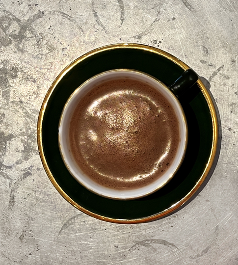
- The Basque country of southwestern France is known for its chocolate, and one day I stopped for a cup. Part of my reason for the photo is that I was taken with the markings on the zinc-topped table, interacting nicely with the gold rim on the plate. Some editing to play with the appearance of the chocolate. Chocolate and Zinc.
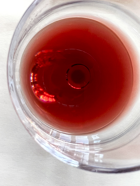
- The next two are both from lunch with friends at one of my favorite restaurants, Les Plaisirs in Peillon, France. Looking down from above, the first photograph is the Red Eye of my glass of wine. No edits.
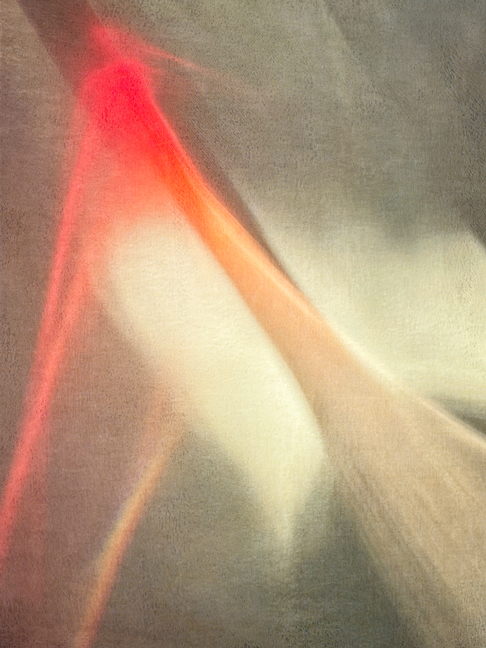
- The second photograph is the play of light from that glass on the surface of the tablecloth. Minimal edits to add texture. Wine Phantom.
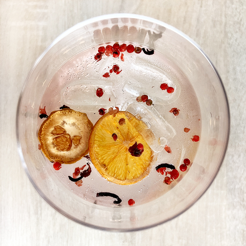
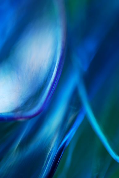
- A very photogenic gin and tonic in Bayonne, France. Minimal edits for light and tone. G&T Bayonne.
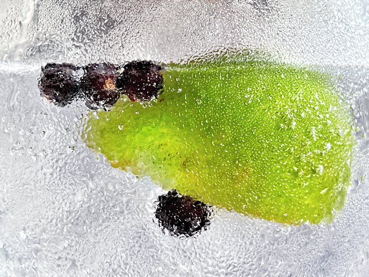
- A few days later, there was another gin and tonic in Biarritz. Minimal editing. Juniper Berries.

Wonderful pictures. I like to take out my camera and start looking around for colors 🙂
Thank you for sharing this with us.
A bientôt
Signe
LikeLike
Hello Signe, how nice to hear from you! I’m glad you enjoyed the photos, and even more, I’m glad you’ve found this way of making your own photographs. À bientôt !
LikeLike